Two plots track how construction forecast matches up to actual spending. The light line is the monthly growth predicted by my forecasting. The same color dark line is the actual spending. The changes in Residential dominate the 1st plot, so the 2nd plot is just Nonresidential to improve the scale.
One comment about the Residential plot: Starts, which are needed to create the forecast, may not have accounted for the extreme inflation, so spending could have easily grown to 5% to 10% higher than the starts would have forecast. Notice the similarity between the two residential plots. Although the forecast is not at the same magnitude as the actual spending, it is still predicting the slope, the change in spending. Jul20 to Jan21 is where the plots varied.
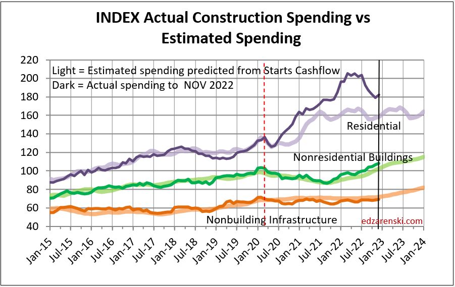
Nonresidential forecasts vs actuals compare really well. By the end of 2020, my model was predicting a low point in nonresidential buildings spending out in the 2nd half of 2021. Nobody else predicted that bottom. The Starts Cashflow model does a good job of predicting spending.

